Gradient UI Fun
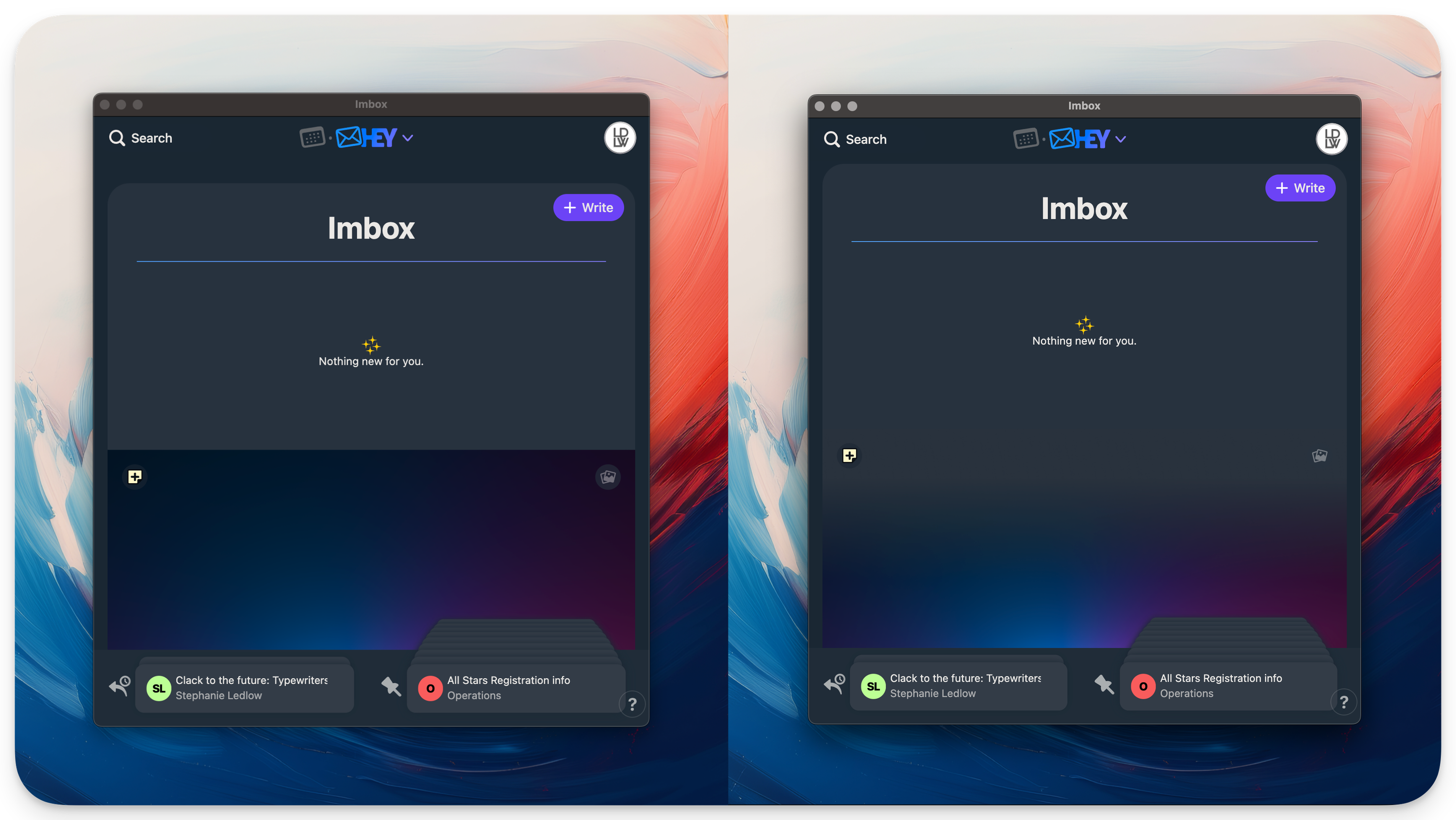
 Gradient UI fun in HEY! - Before & After
Sometimes an idea comes to me and I can’t stop thinking about it until I try it. I’ve been using HEY! for my email since it launched. In they HEY! app, you have a wallpaper at the bottom that covers mail you’ve already read. There are some great included options, but I have always chosen my own image file to customize my email experience slightly.
It struck me that if I edited the image in Figma and added a slight gradient at the top that using the color picker to grab the dark HEY! UI background color, it would make it look like the two panes blend together when I have the wallpaper covering read mail. I dig the effect.
I used the same process on the iOS version of the app (the UI color was slightly darker there) to get the same effect on both platforms. If anyone is interested in how this is done in Figma, reach out!
⭥ Site Index | ↻ Random Post